Friday, October 16, 2009

Week 1 Blog: Other (Book Cover)


This is the book cover to "Twilight." It is very simplistic, but as I've said in most of my other posts, the simplicity makes it effective. The red apple draws attention because the color is contrasting to the rest of the image. The white arms also draw attention because essentially they are just very, very thick white diagonal lines. They bring focus to the apple as well as creating the V shape within them bringing more emphasis to the title of the novel, "Twilight." Then, you can view the arms/apple as instead of a V, an arrow, so it points directly to the author, Stephenie Meyer. The black background gives a good contrast to the white arms and the white lettering, making them more visible and drawing more focus to them.

As much as the pop-culture craze of Twilight may annoy people, what with the young female teens screaming whenever they see a trailer for it and having posters and t-shirts and buttons of all their favorite characters paraded everywhere, one cannot deny that the marketing, and simplicity of the images, does draw attention to it. It is very effective and even got me reading the books just to see what all the fuss was about.
Week 1 Blog: Ours (Music Cover)

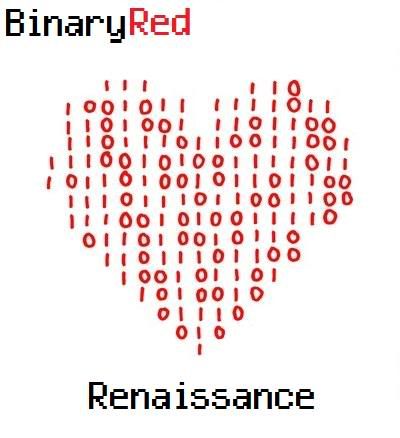
This is an album cover I made for a music project. The band is named BinaryRed makes trance / electronica music. I chose a type face that would go along with their name, a computer style (I can't remember the name of it right now) then I found an image of a heart in binary, but had black 1s and 0s around it. So I edited out the black 1s and 0s to bring a clearer focus to the image and added in the layers for the band title at the top, and album title at the bottom. The band was pleased with this cover. Their music is simplistic in its execution so they didn't want too much going on in their album cover. They thought this was perfect because it clearly showed who they were without clutter or confusion.

Week 1 Blog: Other (Movie Poster)

The effectiveness of this movie poster is its use of color contrast (saturated reds with very unsaturated, dull, grays, whites, blacks) to draw attention to the very center of the piece. This poster also uses lines to its advantage, many vertical lines on the wall and floorboards keep the attention moving back to the center, as well as the diagonals from the window drawing attention back to the room. The lines have a circular motion to them always bringing attention back to where it needs to be. Even Sweeney Todd's pants have vertical and diagonal lines to keep the focus moving.

The type then is red for the tagline, making it pop, and it is clearly visible because it is right down one of the vertical lines so our eyes wont miss it. Then the "Johnny Depp is Sweeney Todd" has a very large font size, with more of a silver to make it pop more than the other colors, and the use of the red horizontal and red splash on the name draws focus to it more because the line is a contrasting direction to everything else. It has a visual hierarchy of large object (chair, Todd), lines bringing focus down to tagline, then down more to the title and other information.

I really liked this poster because when I first looked at it I thought it was very simple, but also incredibly eye catching, but the more I learned about why it was eye catching, the more I realized it was quite complex.

Week 1 Blog: Ours (Flyer)


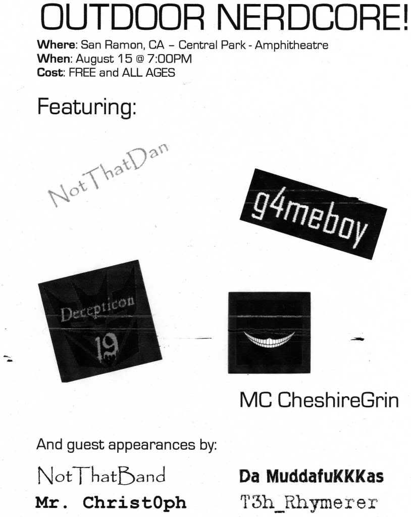
This is a flyer I made for a concert in my hometown for "nerdcore" rap artists. It uses elements of the collage style but mostly focuses on a visual hierarchy and font/type face to capture interest and (hopefully) be effective. The large lettering at top captures attention and gives all the details, font getting smaller in size as it goes down. Then I cut and pasted the names/images of the main artists performing and put it in a collage style under that and the minor/guest artists listed at the bottom. Overall I thought this was an effective poster (granted this is a black and white scanned copy so it's not the same) and generated a pretty good turn out for the show. All the bands were pleased.

Monday, October 12, 2009

Week 1 Blog: Ours (Collage)

This is the collage I created for Digital Media Foundations 201. This was my first time using photoshop or making a digital collage. Before this project I always assumed a collage was just taking various clippings and throwing them randomly onto a piece of paper, now I know it's more just about the layers and how the come together to form a fitting aesthetic. For this collage I got a picture off the DMF website, edited out the child's face, added in a cut image of Sarah Palin's face that I thought could be appropriate to the phrase on the left hand side (the "harmonica band" line). Then I cropped the face a little bit more to fix the neck line and try to make it more natural. I made the whole photo black and white so Palin would look more similar to the photo (though I couldn't find a way to make her face look as aged as the rest of the image). Then with type I made it a mock-political election poster by writing "Sarah Palin 2012, Education for the future" in a type face that I thought would appeal to the jokes people make about Palin's militarism and add a funny contrast of serious and "down to business" type in relation to an obviously silly image. I hope not to offend anyone by this, just having a little fun. I suppose this was a way for me to give a nod and not-so-subtle reference to jibjab which is something I find incredibly entertaining.

Week 1 Blog: Other

This photo really intrigued me. With the work we've done in photoshop lately I tried to see how an image like this was created. I'm assuming the left half is an actual photo whereas the right half is some sort of layering. My first impression of the right half was that the shape resembled a monkey's face. I doubt that's what the intention was, but it could relate to an idea that the image as a whole is about how music shapes who we are. Music is fed into / through our mind shaping who we are as individuals. As there is always new music to listen to (if one doesn't have a post-modern perspective) our "form" is constantly changing and evolving, just like this particular record is shaping the form on the other side. The image is clean, dimensions are well laid out, and the composition use of a line straight down the center and the line created by the arm horizontally attracts clear attention to the image and directs our view right to the record and other form. It is also effective due to the use of color contrast, black on a light blue background. Very eye catching.

Tuesday, October 6, 2009

This is a large picture. I apologize. I will discuss this later.