Friday, October 30, 2009

Picturing The Other - In Lab Work


Here are the edits I made to an image using the curves feature, saturation/intensity, hues, layering with opacity, etc in lab October 24.

The original image had many different blues, yellows, oranges, etc. A very colorful futuristic looking image. I changed it to look more dark and sinister, almost trying to give it a graphic novel look. The red and greens was achieved on accident but I really liked them, making me think of the Teenage Mutant Ninja Turtles.

Portraits


Haven't had time to tweak these in photoshop but here are the portraits I have chosen.

Other - My little bearded dragon, Odin

Self - Halloween costume of Dr Doom, liked the blur effect creating lines/movement

Friend - My friend being ironic with a batman mask and joker jacket, the silly look and mirror add to the irony: Batman looks at himself and realizes he's not the same as he used to be.

Alphabet Soup


Here are the images for my Alphabet Soup assignment. Honestly I haven't had time to do any tweaking in photoshop yet.

X - Electric piano stand
I - Light switch
A - Matches
F - Paperclip
O - Clock

Monday, October 26, 2009

Blog 2 (other)


So I'm not sure if this is allowed, but this is someone else's work that I am commenting on so I'm assuming it is okay, even if it's someone else in the class.

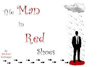
I really liked this image when I first saw it after going through other students blogs. It really stuck out to me. I am a huge Coen Brothers fan and this image felt like it could be a poster for a new movie of theirs. The simple style, the red/black/white color palette. It reminded me a lot of "Burn After Reading" poster or the upcoming George Clooney movie "Up In The Air."

I don't really know what to say about the image, except that it really captures my attention. It has a strong use of visual hierarchy (I seem to talk about that a lot), or lines (are they the same?). The title goes down in a diagonal line to the man, the rain from the cloud goes to the man, the footsteps go to the man, etc etc. Plus the largest consistent use of red is the pool under the mans feet, drawing attention to it as well. As our attention is drawn to the man, we find out all the information we need, the title, the author and maybe some clues as to what this book/movie/what-have-you will be about.

CD Album Cover

This is an image I made for another band called "Jacob and the Blacks." The title of the album was "Howl For the Wolf Pack!" I'm not sure why the image is so small on this blog or why the lettering looks more blurry (it's more clear in the original). The album is werewolf themed to I found a nice simple image of a wolf howling at the moon with enough blank space to mess with. I don't have photoshop on my mac so I settled with the far less versatile downloaded app "Paintbrush." I have yet to find out if Paintbrush has a free transform tool like photoshop, so I had to settle with making the words be straight. I would have put them at an angle otherwise. I chose a blood red color to stay with the werewolf theme and chose the cracked font to give a worn / edgy look to it.

Had I had more sophisticated applications to work with I would have wanted to add more effects, but this, like all the other things I have submitted was more about the simplicity of the image conveying everything it needed to. No frills.

I'm starting to get the feeling I need to experiment more.

Friday, October 23, 2009

Movie Posters (part II)

I stared this movie poster after finding the smoke image and the vampire teeth image. I cropped the teeth and tried to clean it up a bit, yet still make it look tattered and layered it over the smoke. I have always wanted to make a zombie movie called "The End Is Nigh" so with that title in mind I used that for the movie poster and added in the tag line diagonally to capture interest and bring focus to the title and teeth separately.


After viewing the image a second time however, it really reminded me of the style of classic grindhouse posters so I decided to try and make it black and white instead. I mostly used the black and white photoshop tools to emphasize the change in reds and blues for this second image. I also added in a release date for it, continuing in the style of the cracked font for an apocalyptic feel.

Last but not least, I changed the image again to try and go completely over-the-top with the grindhouse look to create the third image. I recropped the vampire teeth to give a black border around them to make them pop more, moved the tagline lower and smaller and added in more lettering because most grindhouse posters I have seen are very cluttered with focus drawing your attention everywhere (much like the films themselves do).

Overall I'm happiest with the second image because I really like the black and white look and I think the cracked font is better than the fancier font for relaying the message. Plus, I like my images to more simplistic and to the point (as shown by the other work I've put up) so although the clutter is what I wanted for the third, I find the second much more effective.

Movie Posters

This movie poster was made after I found the image of the grass house and thought of the phrase "Those who live in glass houses." Then I came up with a long backstory of what the movie would actually be with a guy hearing it wrong and living in a grass house instead. I didn't do much editing to the individual image, this was mostly a test of finding a typeface / font that I felt would best compliment the grass house image. Then after finding a font I liked, played around with the size of the fonts as well as color to create visual hierarchy and focus. The names of the actors / actresses / director were chosen off the top of my head but I think it could make an enjoyable movie.