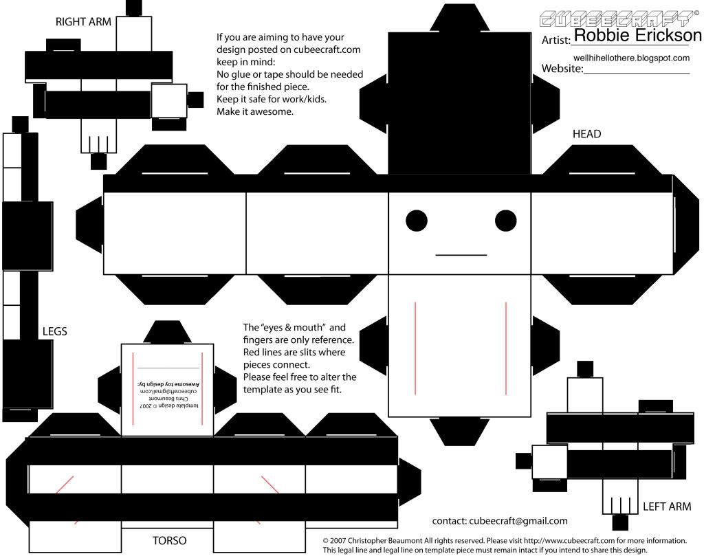
 HHere is my papercraft. Yes, it's simplistic but the only thing I could think of making was a mime, so that's what I did. I tried cutting / making it with normal computer paper and that didn't work out too well. I'm going to use photo quality paper for my next attempt over Thanksgiving break.
Thursday, November 19, 2009
Papercraft
HHere is my papercraft. Yes, it's simplistic but the only thing I could think of making was a mime, so that's what I did. I tried cutting / making it with normal computer paper and that didn't work out too well. I'm going to use photo quality paper for my next attempt over Thanksgiving break.
Scratch Art
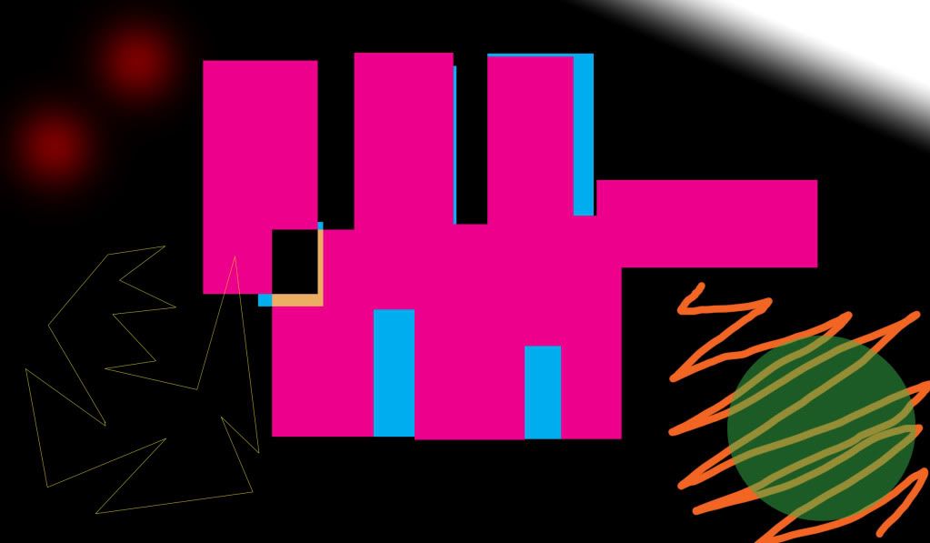 Here is my scratch art project. Again I went with abstract ideals. This project basically was me testing out different layer effects tools like opacity and changing colors and such (I don't remember the specific names at the moment but they are on the drop down menu when you select a layer, like "overlay").
Are the red dots on the top left corner tail-lights or eyes?
Friday, October 30, 2009
Picturing The Other - In Lab Work
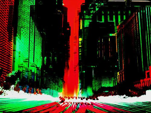
Here are the edits I made to an image using the curves feature, saturation/intensity, hues, layering with opacity, etc in lab October 24.
The original image had many different blues, yellows, oranges, etc. A very colorful futuristic looking image. I changed it to look more dark and sinister, almost trying to give it a graphic novel look. The red and greens was achieved on accident but I really liked them, making me think of the Teenage Mutant Ninja Turtles.
Portraits


Haven't had time to tweak these in photoshop but here are the portraits I have chosen.
Other - My little bearded dragon, Odin
Self - Halloween costume of Dr Doom, liked the blur effect creating lines/movement
Friend - My friend being ironic with a batman mask and joker jacket, the silly look and mirror add to the irony: Batman looks at himself and realizes he's not the same as he used to be.
Alphabet Soup


Here are the images for my Alphabet Soup assignment. Honestly I haven't had time to do any tweaking in photoshop yet.
X - Electric piano stand
I - Light switch
A - Matches
F - Paperclip
O - Clock
Monday, October 26, 2009
Blog 2 (other)

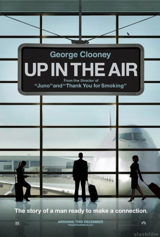
So I'm not sure if this is allowed, but this is someone else's work that I am commenting on so I'm assuming it is okay, even if it's someone else in the class.
I really liked this image when I first saw it after going through other students blogs. It really stuck out to me. I am a huge Coen Brothers fan and this image felt like it could be a poster for a new movie of theirs. The simple style, the red/black/white color palette. It reminded me a lot of "Burn After Reading" poster or the upcoming George Clooney movie "Up In The Air."
I don't really know what to say about the image, except that it really captures my attention. It has a strong use of visual hierarchy (I seem to talk about that a lot), or lines (are they the same?). The title goes down in a diagonal line to the man, the rain from the cloud goes to the man, the footsteps go to the man, etc etc. Plus the largest consistent use of red is the pool under the mans feet, drawing attention to it as well. As our attention is drawn to the man, we find out all the information we need, the title, the author and maybe some clues as to what this book/movie/what-have-you will be about.
CD Album Cover
 This is an image I made for another band called "Jacob and the Blacks." The title of the album was "Howl For the Wolf Pack!" I'm not sure why the image is so small on this blog or why the lettering looks more blurry (it's more clear in the original). The album is werewolf themed to I found a nice simple image of a wolf howling at the moon with enough blank space to mess with. I don't have photoshop on my mac so I settled with the far less versatile downloaded app "Paintbrush." I have yet to find out if Paintbrush has a free transform tool like photoshop, so I had to settle with making the words be straight. I would have put them at an angle otherwise. I chose a blood red color to stay with the werewolf theme and chose the cracked font to give a worn / edgy look to it.
Had I had more sophisticated applications to work with I would have wanted to add more effects, but this, like all the other things I have submitted was more about the simplicity of the image conveying everything it needed to. No frills.
I'm starting to get the feeling I need to experiment more.
Subscribe to:
Posts (Atom)