Friday, October 30, 2009

Picturing The Other - In Lab Work


Here are the edits I made to an image using the curves feature, saturation/intensity, hues, layering with opacity, etc in lab October 24.

The original image had many different blues, yellows, oranges, etc. A very colorful futuristic looking image. I changed it to look more dark and sinister, almost trying to give it a graphic novel look. The red and greens was achieved on accident but I really liked them, making me think of the Teenage Mutant Ninja Turtles.

Portraits


Haven't had time to tweak these in photoshop but here are the portraits I have chosen.

Other - My little bearded dragon, Odin

Self - Halloween costume of Dr Doom, liked the blur effect creating lines/movement

Friend - My friend being ironic with a batman mask and joker jacket, the silly look and mirror add to the irony: Batman looks at himself and realizes he's not the same as he used to be.

Alphabet Soup


Here are the images for my Alphabet Soup assignment. Honestly I haven't had time to do any tweaking in photoshop yet.

X - Electric piano stand
I - Light switch
A - Matches
F - Paperclip
O - Clock

Monday, October 26, 2009

Blog 2 (other)


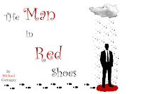
So I'm not sure if this is allowed, but this is someone else's work that I am commenting on so I'm assuming it is okay, even if it's someone else in the class.

I really liked this image when I first saw it after going through other students blogs. It really stuck out to me. I am a huge Coen Brothers fan and this image felt like it could be a poster for a new movie of theirs. The simple style, the red/black/white color palette. It reminded me a lot of "Burn After Reading" poster or the upcoming George Clooney movie "Up In The Air."

I don't really know what to say about the image, except that it really captures my attention. It has a strong use of visual hierarchy (I seem to talk about that a lot), or lines (are they the same?). The title goes down in a diagonal line to the man, the rain from the cloud goes to the man, the footsteps go to the man, etc etc. Plus the largest consistent use of red is the pool under the mans feet, drawing attention to it as well. As our attention is drawn to the man, we find out all the information we need, the title, the author and maybe some clues as to what this book/movie/what-have-you will be about.

CD Album Cover

This is an image I made for another band called "Jacob and the Blacks." The title of the album was "Howl For the Wolf Pack!" I'm not sure why the image is so small on this blog or why the lettering looks more blurry (it's more clear in the original). The album is werewolf themed to I found a nice simple image of a wolf howling at the moon with enough blank space to mess with. I don't have photoshop on my mac so I settled with the far less versatile downloaded app "Paintbrush." I have yet to find out if Paintbrush has a free transform tool like photoshop, so I had to settle with making the words be straight. I would have put them at an angle otherwise. I chose a blood red color to stay with the werewolf theme and chose the cracked font to give a worn / edgy look to it.

Had I had more sophisticated applications to work with I would have wanted to add more effects, but this, like all the other things I have submitted was more about the simplicity of the image conveying everything it needed to. No frills.

I'm starting to get the feeling I need to experiment more.

Friday, October 23, 2009

Movie Posters (part II)

I stared this movie poster after finding the smoke image and the vampire teeth image. I cropped the teeth and tried to clean it up a bit, yet still make it look tattered and layered it over the smoke. I have always wanted to make a zombie movie called "The End Is Nigh" so with that title in mind I used that for the movie poster and added in the tag line diagonally to capture interest and bring focus to the title and teeth separately.


After viewing the image a second time however, it really reminded me of the style of classic grindhouse posters so I decided to try and make it black and white instead. I mostly used the black and white photoshop tools to emphasize the change in reds and blues for this second image. I also added in a release date for it, continuing in the style of the cracked font for an apocalyptic feel.

Last but not least, I changed the image again to try and go completely over-the-top with the grindhouse look to create the third image. I recropped the vampire teeth to give a black border around them to make them pop more, moved the tagline lower and smaller and added in more lettering because most grindhouse posters I have seen are very cluttered with focus drawing your attention everywhere (much like the films themselves do).

Overall I'm happiest with the second image because I really like the black and white look and I think the cracked font is better than the fancier font for relaying the message. Plus, I like my images to more simplistic and to the point (as shown by the other work I've put up) so although the clutter is what I wanted for the third, I find the second much more effective.

Movie Posters

This movie poster was made after I found the image of the grass house and thought of the phrase "Those who live in glass houses." Then I came up with a long backstory of what the movie would actually be with a guy hearing it wrong and living in a grass house instead. I didn't do much editing to the individual image, this was mostly a test of finding a typeface / font that I felt would best compliment the grass house image. Then after finding a font I liked, played around with the size of the fonts as well as color to create visual hierarchy and focus. The names of the actors / actresses / director were chosen off the top of my head but I think it could make an enjoyable movie.

Letter Assignment


This is the final letter assignment. Not many effects were added to this, it was mostly layering, changes in type font, visual hierarchy, and color. I wanted to keep the image simple and unobtrusive, while still trying to create a sense of action with the lines of the Es drawing your attention to different parts of the image. I chose the center e to be in helvetica because I worked on this assignment the week we watched that documentary. It was my design statement I suppose. The yellow fancy Es on the corners were supposed to draw attention and focus to the helvetica e showing that the fancy serifed style of writing was being changed. All the other formats were being layered over each other so none were too visible. Only the helvetica e. Most of the colors except for helvetica are also somewhat subdued, or if they are brighter, it is to point focus towards the helvetica e. As a note with visual hierarchy, attention is also drawn to the helvetica e because it is the largest, most distinct e without being cut or layered by another one.

Friday, October 16, 2009

Week 1 Blog: Other (Book Cover)


This is the book cover to "Twilight." It is very simplistic, but as I've said in most of my other posts, the simplicity makes it effective. The red apple draws attention because the color is contrasting to the rest of the image. The white arms also draw attention because essentially they are just very, very thick white diagonal lines. They bring focus to the apple as well as creating the V shape within them bringing more emphasis to the title of the novel, "Twilight." Then, you can view the arms/apple as instead of a V, an arrow, so it points directly to the author, Stephenie Meyer. The black background gives a good contrast to the white arms and the white lettering, making them more visible and drawing more focus to them.

As much as the pop-culture craze of Twilight may annoy people, what with the young female teens screaming whenever they see a trailer for it and having posters and t-shirts and buttons of all their favorite characters paraded everywhere, one cannot deny that the marketing, and simplicity of the images, does draw attention to it. It is very effective and even got me reading the books just to see what all the fuss was about.

Week 1 Blog: Ours (Music Cover)

This is an album cover I made for a music project. The band is named BinaryRed makes trance / electronica music. I chose a type face that would go along with their name, a computer style (I can't remember the name of it right now) then I found an image of a heart in binary, but had black 1s and 0s around it. So I edited out the black 1s and 0s to bring a clearer focus to the image and added in the layers for the band title at the top, and album title at the bottom. The band was pleased with this cover. Their music is simplistic in its execution so they didn't want too much going on in their album cover. They thought this was perfect because it clearly showed who they were without clutter or confusion.

Week 1 Blog: Other (Movie Poster)

The effectiveness of this movie poster is its use of color contrast (saturated reds with very unsaturated, dull, grays, whites, blacks) to draw attention to the very center of the piece. This poster also uses lines to its advantage, many vertical lines on the wall and floorboards keep the attention moving back to the center, as well as the diagonals from the window drawing attention back to the room. The lines have a circular motion to them always bringing attention back to where it needs to be. Even Sweeney Todd's pants have vertical and diagonal lines to keep the focus moving.

The type then is red for the tagline, making it pop, and it is clearly visible because it is right down one of the vertical lines so our eyes wont miss it. Then the "Johnny Depp is Sweeney Todd" has a very large font size, with more of a silver to make it pop more than the other colors, and the use of the red horizontal and red splash on the name draws focus to it more because the line is a contrasting direction to everything else. It has a visual hierarchy of large object (chair, Todd), lines bringing focus down to tagline, then down more to the title and other information.

I really liked this poster because when I first looked at it I thought it was very simple, but also incredibly eye catching, but the more I learned about why it was eye catching, the more I realized it was quite complex.

Week 1 Blog: Ours (Flyer)


This is a flyer I made for a concert in my hometown for "nerdcore" rap artists. It uses elements of the collage style but mostly focuses on a visual hierarchy and font/type face to capture interest and (hopefully) be effective. The large lettering at top captures attention and gives all the details, font getting smaller in size as it goes down. Then I cut and pasted the names/images of the main artists performing and put it in a collage style under that and the minor/guest artists listed at the bottom. Overall I thought this was an effective poster (granted this is a black and white scanned copy so it's not the same) and generated a pretty good turn out for the show. All the bands were pleased.

Monday, October 12, 2009

Week 1 Blog: Ours (Collage)

This is the collage I created for Digital Media Foundations 201. This was my first time using photoshop or making a digital collage. Before this project I always assumed a collage was just taking various clippings and throwing them randomly onto a piece of paper, now I know it's more just about the layers and how the come together to form a fitting aesthetic. For this collage I got a picture off the DMF website, edited out the child's face, added in a cut image of Sarah Palin's face that I thought could be appropriate to the phrase on the left hand side (the "harmonica band" line). Then I cropped the face a little bit more to fix the neck line and try to make it more natural. I made the whole photo black and white so Palin would look more similar to the photo (though I couldn't find a way to make her face look as aged as the rest of the image). Then with type I made it a mock-political election poster by writing "Sarah Palin 2012, Education for the future" in a type face that I thought would appeal to the jokes people make about Palin's militarism and add a funny contrast of serious and "down to business" type in relation to an obviously silly image. I hope not to offend anyone by this, just having a little fun. I suppose this was a way for me to give a nod and not-so-subtle reference to jibjab which is something I find incredibly entertaining.

Week 1 Blog: Other

This photo really intrigued me. With the work we've done in photoshop lately I tried to see how an image like this was created. I'm assuming the left half is an actual photo whereas the right half is some sort of layering. My first impression of the right half was that the shape resembled a monkey's face. I doubt that's what the intention was, but it could relate to an idea that the image as a whole is about how music shapes who we are. Music is fed into / through our mind shaping who we are as individuals. As there is always new music to listen to (if one doesn't have a post-modern perspective) our "form" is constantly changing and evolving, just like this particular record is shaping the form on the other side. The image is clean, dimensions are well laid out, and the composition use of a line straight down the center and the line created by the arm horizontally attracts clear attention to the image and directs our view right to the record and other form. It is also effective due to the use of color contrast, black on a light blue background. Very eye catching.

Tuesday, October 6, 2009

This is a large picture. I apologize. I will discuss this later.