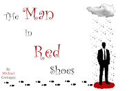
So I'm not sure if this is allowed, but this is someone else's work that I am commenting on so I'm assuming it is okay, even if it's someone else in the class.
I really liked this image when I first saw it after going through other students blogs. It really stuck out to me. I am a huge Coen Brothers fan and this image felt like it could be a poster for a new movie of theirs. The simple style, the red/black/white color palette. It reminded me a lot of "Burn After Reading" poster or the upcoming George Clooney movie "Up In The Air."
I don't really know what to say about the image, except that it really captures my attention. It has a strong use of visual hierarchy (I seem to talk about that a lot), or lines (are they the same?). The title goes down in a diagonal line to the man, the rain from the cloud goes to the man, the footsteps go to the man, etc etc. Plus the largest consistent use of red is the pool under the mans feet, drawing attention to it as well. As our attention is drawn to the man, we find out all the information we need, the title, the author and maybe some clues as to what this book/movie/what-have-you will be about.
No problem about commenting on a fellow student's work.
ReplyDeleteNice analysis. I think the lines are what support the visual hierarchy. Visual hierarchy is the end, the lines are part of the means.